
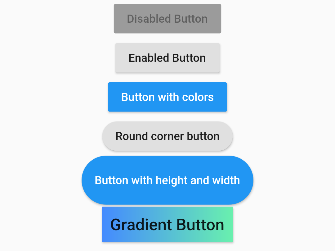
 RaisedButton is a Material design widget. In this post, I am going to show almost all the use cases you might need to know about RaisedButton. A simple usage of RaisedButton would be:
RaisedButton(
  child: Text("Enabled Button"),
  onPressed: (){},
),
For a disabled button:
RaisedButton(
  child: Text("Disabled Button"),
  onPressed: null,
),
Now to add colors the raised button:
RaisedButton(
  color: Colors.blue,
  child: Text("Button with colors", style: TextStyle(color: Colors.white),),
  onPressed: (){},
),
Button with round corners:
RaisedButton(
  child: Text("Round corner button"),
  shape: RoundedRectangleBorder(
    borderRadius: BorderRadius.circular(30)
  ),
  onPressed: (){},
),
Button with custom height and width:
ButtonTheme(
  height: 60,
  minWidth: 200,
  child: RaisedButton(
    shape: RoundedRectangleBorder(
        borderRadius: BorderRadius.circular(30)
    ),
  child: Text("Button with height and width", style: TextStyle(color: Colors.white),),
    onPressed: (){},
  ),
),
Button with gradient background:
RaisedButton(
  onPressed: () {},
  padding: const EdgeInsets.all(0.0),
  child: Container(
    decoration: const BoxDecoration(
      gradient: LinearGradient(
        colors: <Color>[
          Colors.blueAccent,
          Colors.greenAccent
        ],
      ),
    ),
    padding: const EdgeInsets.all(10.0),
    child: const Text(
        'Gradient Button',
        style: TextStyle(fontSize: 20)
    ),
  ),
),
There are many other attributes you can play with like: elevation, focusElevation, hoverElevation, highlighElevation, textColor, splashColor, hoverColor, focusColor, etc. You can find the details at : https://api.flutter.dev/flutter/material/RaisedButton/RaisedButton.html.